Lumino City is a feast for your eyes and that is awesome since the rest kinda sucks.
A puzzle game in its core with a point-and-click-ish adventure game feel, in Lumino City you play as Lumi, a young girl set out to find her missing grandfather. However, there is this underlaying theme of oil corporate "brutality" for us adults to understand, but hey it's just a kids game so lets just stick with that.
So this "mission" or journey sees you going into Lumino City following the breadcrumbs until you find your grandfather. And during this journey, you will interact with many of its residents, helping them with their chores, problems, whatever. Completing puzzles opens up the next area and so on. The problem here is that most of the puzzles are so far out there that they are borderline impossible to understand at first let alone solve them and you have to remember that this is just a kids game.
In each puzzle you have very little to none insight in what to do to actually solve it. When you have that insight the "instructions" on how it works make no sense whatsoever. On top of that you don't really know or distinguish the objects you can interact with which is crucial for a game of this genre. All of these combined make for a very shallow and annoying gameplay. The puzzles suck, all of them. There is one where you have to dig a plot to find some potatoes and one; the instructions are hard to understand, and two; you have to be pixel perfect in what square you tap to give the damn potato out.
Then there are times where you have to simply traverse the world and you just don't know where to go. So you end up brutally tapping the screen until something happens. That is just bad design in my opinion. However there is a silver lining, a mechanic that will make you life way easier. In game there is a handy manual that serves as a walkthrough to every puzzle you will find in your journey. It is a great system that it not only a good thing to have but a necessity in order to get through the game.
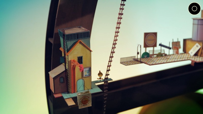
Other than the handy manual that redeems the stupid puzzle designs, the presentation is what totally saves this game. The sound design is just fantastic, with some relaxing and joyous tunes playing in the background. But the artstyle, that what's king here. Every in-game asset is a real-life mockup, from the paper houses to the glass lighthouse to the metal diner, everything was handcrafted and by using macro-photography and overall wizardry the devs have managed to insert them into the game. The first time you see the game in action you will be speechless and awestruck, I was. Then you go to the next area the same feeling, next area same feeling... you get the idea.
Words don't do it justice. I cannot describe how gorgeous it looks and yes, while the screenshots give a really good idea to the look, you have to see it in action. You have to see how beautifully and gracefully the camera shifts and rotates from one area to the next, how the objects move in the world and how vibrant and extremely detailed everything looks like. It's no wonder why they won a BAFTA for Artistic Achievement. And this gorgeous artstyle or look, call it what you want, is the main and probably only reason you have to own and play this game. But keep in mind that if you do get it, get it on Steam or play it on an iPad or on Apple TV, not on an iPhone.Thanks for reading!


